Why serve the ordinary when your wedding feast can feel like a five-star experience? These 23 wedding menu ideas mix gourmet flavors, creative pairings, and eye-catching presentations that turn every plate into an unforgettable part of your celebration.

23 Wedding Menu Ideas That Take Your Reception From Lovely to Legendary in 2025
When it comes to weddings, the menu is more than a meal—it’s the highlight guests will rave about long after the last dance. In 2025, couples are turning dining into an experience: caviar stations paired with champagne, chef-curated tasting menus, and live cooking displays that wow the crowd. Imagine truffle-dusted pastas, artisanal sliders, or even midnight snack bars to keep the energy flowing. Suddenly, food isn’t just served—it’s celebrated.
These 23 wedding menu ideas are decadent, unforgettable, and designed to impress. They’ll help you craft a feast that feels as grand and meaningful as the day itself.
1.Golden Luxe

This shimmering gold menu with rose-cut detailing feels unapologetically elegant. The metallic finish catches candlelight, making every place setting look instantly more luxurious. Draped over deep plum silk, it sets the stage for a dinner that’s nothing short of regal.
Menus like these aren’t just paper—they’re part of the décor. They bring texture, shine, and a sense of grandeur. I’d suggest them for black-tie weddings where every detail has to impress.
2. Black Ribbon Classic

Minimalist design meets timeless charm in this crisp white menu tied with a black ribbon. Set on a glass charger with sleek tableware, the look is clean, modern, and effortlessly sophisticated. It makes the dining experience feel curated without being overdone.
If you want your menus to feel chic yet approachable, this style nails it. The ribbon adds a soft layer of detail. Perfect for contemporary city weddings where elegance is all about balance.
3. Wax-Sealed Chic

A simple ivory menu elevated with gold wax seals and calligraphy-style fonts feels classic and refined. The embossed seals add texture and a personal touch that guests will notice right away. It’s an understated way to mix tradition with elegance.
Wax seals work beautifully for vineyard or heritage venues. They bring timelessness to even the simplest layouts. I’d choose this design for couples who want their details to feel polished but never fussy.
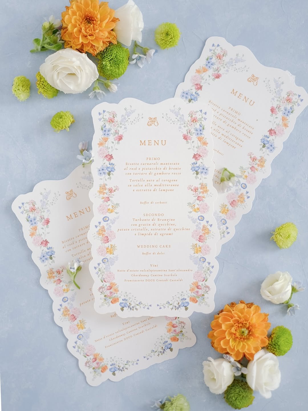
4. Soft Floral Script

Delicate script fonts paired with soft watercolor florals make this menu feel light and feminine. The pastel tones balance beautifully against neutral linens, giving the entire table a romantic glow. It’s timeless without ever feeling too formal, perfect for a dreamy reception.
Menus like these shine in garden or spring weddings. They add color without overpowering the tablescape. I’d recommend them for couples who want elegance with a touch of softness.
5. Artistic Border

Delicate hand-drawn borders frame each line of the menu, adding subtle artistry. The soft ink and ivory paper blend perfectly with rustic, organic-inspired tablescapes. It looks personal while staying refined.
This menu feels at home in vineyard weddings or countryside receptions. The borders add personality without clutter. It’s ideal for couples who want design touches that feel handcrafted.
6. Rustic Charm

A kraft-paper inspired menu with bold serif fonts gives this setting a rustic, cozy edge. Paired with wooden chargers and natural textures, it feels approachable but still intentional. The design captures the warmth of fall or countryside weddings.
Rustic menus like this are perfect for outdoor barns or intimate gatherings. They bring a sense of charm and ease. It’s a detail guests will appreciate for its sincerity.
7. Elegant Bow-Tied Minimalism

Satin ribbon meets textured cardstock in this timeless menu design. The ivory bow feels romantic without being fussy, instantly elevating each place setting. Embossed type on creamy paper adds depth and tactile charm. It’s quiet luxury translated into a wedding detail.
I love how it turns the menu into both décor and keepsake. The bow adds softness, the paper gives substance, and the whole look feels curated. Perfect for couples aiming for elegance with restraint.
8. Minimalist Drinks Elegance

Clean white stock, delicate typography, and a clipped name card make this drinks menu feel effortlessly refined. Each piece is elevated with a subtle metallic clip, adding personality without clutter. The balance of space, fonts, and accents is striking in its restraint. Simplicity never looked so intentional.
I love how the name card doubles as personalization for guests. It’s a sleek way to tie seating with the menu while staying on-theme. A small detail that creates a polished, cohesive experience.
9. Minimalist Black and White Menu

A sleek black-and-white menu instantly elevates the table setting. Clean typography paired with a bold “Welcome” line gives it a modern yet timeless edge. It looks polished against simple tableware and pairs perfectly with neutral linens. This style shows that less is definitely more when it comes to elegant presentation.
I’d recommend this design for couples who love a sophisticated, understated aesthetic. It lets the food take center stage while still making guests feel personally welcomed. A versatile look that works across all wedding themes.
10. Bow-Tied Elegance

These menus topped with satin bows are a sweet way to add texture and charm. They double as décor, instantly dressing up a place setting without the need for extra details. The handwritten names tucked beneath the bows make each menu feel like a keepsake. It’s personal, polished, and oh-so-romantic.
This would be my go-to choice for couples who want both function and flair. A tied ribbon can subtly match your wedding palette and instantly unify the table design. It’s classic elegance with a playful twist.
11. Paperclip Chic

Here, menus are elevated with a simple gold paperclip holding a name card. The clean design, muted tones, and delicate font give off effortless style. It’s proof that a small detail can make paper feel incredibly special. Paired with neutral napkins and gold cutlery, it’s minimal luxury at its best.
I’d copy this idea for a modern wedding dinner where less is more. It’s easy to recreate and affordable yet gives guests a tailored experience. Think of it as quiet luxury for your table.
12. Romantic Blush Table Menu

Placed at each setting, these long blush menus feel soft and romantic. The table setup with gold flatware and neutral florals adds to the gentle atmosphere. It’s subtle but thoughtful, giving guests a seamless preview of what’s to come. Everything feels cohesive yet not overworked.
This option is perfect for anyone wanting understated romance with a modern edge. I’d use this style for intimate weddings or dinners where you want a refined, serene mood. It’s elegance without being fussy.
13. Floral Frame Delight
Menus edged with watercolor florals feel like a celebration on their own. The scalloped design and pastel borders make them instantly memorable. Bright blooms scattered around the table tie the look together beautifully. It’s a design that feels joyful, seasonal, and perfect for spring or summer weddings.
This is the pick I’d suggest for couples wanting charm and color at the table. It’s whimsical without being childish and instantly brightens the mood. A gorgeous way to add personality to your reception.
14. Wax Seal Sophistication

A wax seal at the top of the menu instantly gives it old-world charm. The crisp layout paired with elegant typography makes it timeless. Set against neutral plates, it exudes quiet refinement and thoughtful detail. It’s the type of menu you almost don’t want to throw away.
I’d lean into this if you’re planning a classic or vintage-inspired celebration. It adds gravitas without being overwhelming, and the seal can even match your wedding crest. A small touch that makes a big impact.
15. Soft Botanical Style

This menu uses floral illustration to bring in nature without overpowering the layout. The minimal green text paired with soft neutral plates feels fresh and balanced. It’s simple yet polished, leaning into elegance without being overly formal. The design feels versatile across seasons.
I’d recommend this style for garden weddings or outdoor receptions. It adds subtle personality while staying timeless and clean. A lovely choice for couples who want relaxed elegance with a natural nod.
16. Regal Monogram Look

Menus with ornate monograms instantly feel stately and refined. Black-and-white printing with intricate frames makes each one feel personalized and formal. They evoke a sense of tradition while still reading modern in their clean presentation. It’s the kind of menu that makes a dinner feel important.
This design is perfect if you want your reception to lean into heritage or legacy. I’d personally use it for grand venues or black-tie weddings. It’s elevated, timeless, and truly regal.
17. Classic Framed Simplicity

These menus come with an elegant frame-cut edge and a structured layout. The soft grey print against textured paper feels both timeless and quietly luxe. A touch of gold cord detail adds refinement without overwhelming the design. It’s simple, structured, and speaks to those who appreciate tradition.
This would be perfect for couples who want a straightforward yet formal look. I’d suggest pairing with gold or silver accents on the table for an elevated finish. It’s an ideal choice for black-tie weddings.
18. Ribbon-Tied Luxury

Embossed menus paired with creamy satin ribbons bring immediate sophistication. The subtle monogramming and clean text are softened by the romantic bow detail. It feels both modern and heirloom-worthy, like something guests would treasure after the event. A design that’s understated but deeply chic.
I’d recommend this for anyone planning a luxe wedding with soft neutrals or pastels. The ribbons can easily match your theme colors while keeping the look timeless. Think refined elegance with a personal touch.
19. Heritage-Inspired Detailing

These menus, with embossed borders and long, slim silhouettes, carry old-world charm. The green and white plate pairing makes the text pop, creating a balance between tradition and modernity. It’s minimal in design but feels steeped in cultural richness. A menu style that commands quiet respect.
I’d lean into this for heritage venues or destination weddings in classic settings. It sets the right tone of formality without being too ornate. A strong pick for elegant, dinner-focused celebrations.
20. Modern Sage Minimalism

Printed on sage cardstock, this menu feels effortlessly fresh. White serif text stands out against the earthy tone, paired with a monogram at the base for polish. It’s clean, minimal, and incredibly modern while still keeping warmth. The overall effect feels calming yet sophisticated.
I’d suggest this for couples who prefer muted palettes or earthy themes. It works beautifully for outdoor or minimalist settings. A chic, contemporary choice with subtle personality.
21.Gold Rim Sophistication

A tall white menu rests perfectly on a glass charger rimmed with gold beading. The monogram at the top elevates the piece, while the slim, vertical layout keeps things chic. Paired with gold cutlery, the menu feels like part of the table jewelry. Understated but absolutely striking.
This is a great fit for modern glam weddings that want polish without going overboard. I’d recommend it for receptions with metallic accents and neutral backdrops. It’s elegant and versatile.
22. Playful Illustrated Charm

Hand-drawn icons and casual script make these menus stand out with personality. From wine bottles to slices of cake, the doodle-style sketches feel fun and engaging. It’s whimsical yet well thought out, turning menus into conversation starters. Perfect for couples who want lighthearted energy at their wedding.
I’d suggest this design for relaxed weddings or outdoor parties. It’s also a great way to make kids or casual guests feel included. A playful menu that breaks tradition in the best way.
23.Botanical Minimalism

A clean, simple menu design topped with green botanical accents brings freshness to the table. Placed against a modern blue plate, the balance of earthy and contemporary tones shines through. The uncluttered layout makes it elegant and easy to read while still offering visual charm.
This would be a great fit for garden weddings or seaside receptions. I’d pair it with natural textures like linen runners and fresh blooms for a cohesive style. It’s a modern minimal look with organic warmth.